
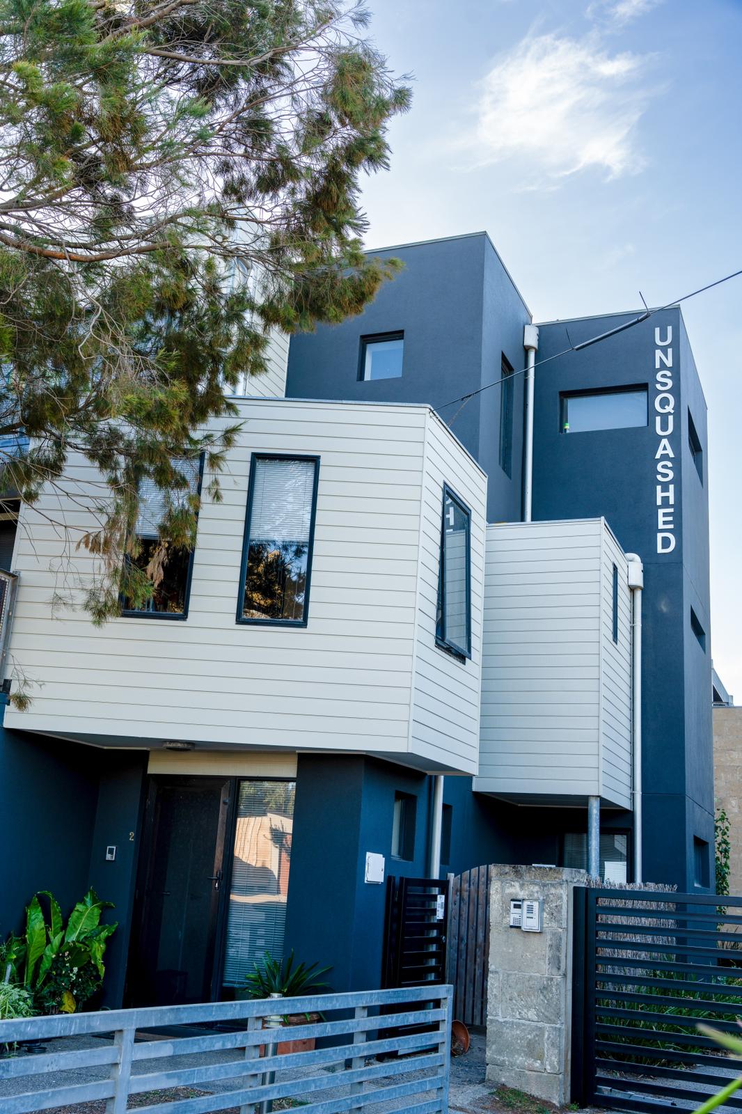
Two-tone exteriors are the default on most well-resolved Melbourne houses, and most people never consciously notice them. One colour on the broad wall areas, a second on the trim, and often a third on the front door. Done well it reads as deliberate. Done badly it reads as a house that has been painted in whatever was left over.
Here is how the pairing actually gets decided.
What two-tone exteriors are actually doing
Trim colour is structural, not decorative. It draws the outline of the house — the fascia line, the window openings, the verandah posts, the corner boards — and that outline is what makes a facade look proportioned or awkward.
A light trim against a darker body pushes the outline forward and makes the house look wider and lower. A dark trim against a lighter body makes window openings read as deeper and the overall form look crisper and more contained. Neither is correct; they do different jobs on different houses.
This is why two-tone exteriors work on houses that look wrong in a single colour. A plain brick veneer with no articulation gains a shape it did not have. A period facade with a lot of detail gets that detail read properly instead of disappearing into one flat field.
The three-element structure
Almost every successful scheme breaks into three parts, in descending order of area.
- The body. Walls, render, weatherboards, brick if it is being painted. This is 70 to 80 per cent of what you see and should be the quietest colour.
- The trim. Fascia, barge boards, window frames and sills, door frames, corner boards, verandah posts and balustrade. Perhaps 15 to 25 per cent.
- The accent. Front door, and sometimes the gate or a feature panel. Under 5 per cent, and this is where a strong colour belongs if you want one.
Trouble almost always comes from pushing the body colour too hard. A saturated colour over 75 per cent of a facade stops being a colour choice and becomes the whole house.
How much contrast is enough
The practical measure is light reflectance value — how much light a colour bounces back, on a scale from 0 to 100. Every Australian paint brand publishes it.
For two-tone exteriors to read as intentional from the street, you want a meaningful gap between body and trim. Under about 15 points of LRV difference, the two colours look like a mistake rather than a pairing — close enough that people assume one has faded. Thirty points or more reads clearly as deliberate.
The trap is choosing both colours from the same strip on a fan deck. Those are designed to harmonise, which means they are close in LRV, which is exactly what you do not want across body and trim.
Pairings by Melbourne house type
- Victorian terrace. Traditionally a mid-tone body with much lighter trim picking out the parapet, window reveals and cast iron. Heritage overlays often constrain the palette, so check before committing.
- Edwardian and Californian bungalow. These carry deep, earthy body colours well — olive, heritage green, muted red — with cream or off-white trim and a stained or strongly coloured door.
- Weatherboard cottage. The classic is a light body with white or near-white trim, which keeps the boards looking crisp. Darker bodies work but the exposed elevations will want watching.
- Seventies and eighties brick veneer. Usually the brick stays and the scheme is built around it, with trim and gutters doing all the work. If the brick is being painted, this is where two-tone exteriors transform a house most dramatically.
- Modern render. Often a very low-contrast body with a strong dark trim, or the reverse. The flat unbroken surfaces mean the trim line is doing all the definition.
The colour you did not choose
Your roof is already a colour, and on most Melbourne houses it is a Colorbond profile that is not being repainted. So is your guttering, and often your window frames if they are powder-coated aluminium.
That means you are not picking two colours, you are picking two colours that have to sit with one or two existing ones. A scheme developed without the roof colour in front of you will fight it.
Take a Colorbond sample out and hold it against your candidates in daylight. A warm grey body that looks perfect indoors can turn distinctly pink next to a cool charcoal roof.
Where the trim colour actually goes
Worth agreeing explicitly before work starts, because this is a common source of disappointment.
- Window frames and sashes: usually trim colour.
- Window sills and reveals: trim, and this is often where people expect body.
- Fascia and barge boards: trim.
- Gutters: frequently left as existing Colorbond, or painted to match trim.
- Downpipes: body colour if you want them to disappear, trim if you want the vertical line.
- Verandah posts, beams and balustrade: trim, though a dark post against a light body is a legitimate choice.
- Eaves linings: almost always the lightest colour in the scheme. Dark eaves make a house feel heavy and close.
Testing, properly
Paint chips lie. They are too small, they are viewed against white, and they are viewed indoors.
Buy sample pots and paint A3 or larger boards, two coats, then move them around the house through a full day. Look at them on the shaded south side and on the hot west elevation, in the morning and at four in the afternoon. A trim white that reads clean at midday can look distinctly yellow in late afternoon light.
Hold the body and trim boards together at the distance people actually see the house from, which is the footpath, not arm’s length.
Mistakes we see repeatedly
- Four or five colours. Three is the limit for almost every house.
- Trim lighter than body on a hot west elevation, in a bright white that then shows every mark.
- Picking the scheme indoors under artificial light.
- Ignoring the neighbours entirely. You do not have to match, but on a terrace row a scheme that clashes hard with both sides stands out badly.
- Matching a painted render colour to an unpainted brick that will weather and shift over time.
We will work the scheme through with you
We put sample boards up on your actual walls and look at them across the day before anything is committed. If you want help pairing body and trim for your house, call 0404 330 332.
📍 Our Service Areas Across Melbourne, the Mornington Peninsula, Surf Coast & Phillip Island
Melbourne & Bayside
- Expert Painting and Renovation in Richmond
- Expert Painting and Renovation in St Kilda
- Expert Painting and Renovation in South Yarra
- Expert Painting and Renovation in Malvern
- Expert Painting and Renovation in Hawthorn
- Expert Painting and Renovation in Kew
- Expert Painting and Renovation in Balwyn
- Expert Painting and Renovation in Mount Waverley
- Expert Painting and Renovation in Ringwood
- Expert Painting and Renovation in Doncaster
- Expert Painting and Renovation in Hampton
- Expert Painting and Renovation in Frankston
- Expert Painting and Renovation in Mount Eliza
- Expert Painting and Renovation in Mornington
- Expert Painting and Renovation in Mount Martha
- Expert Painting and Renovation in Rosebud
- Expert Painting and Renovation in Sorrento
Phillip Island & Bass Coast
- Expert Painting and Renovation in Flinders
- Expert Painting and Renovation in Somers
- Expert Painting and Renovation in San Remo
- Expert Painting and Renovation in Cape Woolamai
- Expert Painting and Renovation in Cowes
- Expert Painting and Renovation in Coronet Bay
- Expert Painting and Renovation in Tootgarook
- Expert Painting and Renovation in Rye
- Expert Painting and Renovation in Blairgowrie
- Expert Painting and Renovation in Portsea
- Expert Painting and Renovation in Inverloch
- Expert Painting and Renovation in Kilcunda
- Expert Painting and Renovation in Ventnor
- Expert Painting and Renovation in Newhaven
Surf Coast & Bellarine Peninsula
- Expert Painting and Renovation in Geelong
- Expert Painting and Renovation in Torquay
- Expert Painting and Renovation in Ocean Grove
- Expert Painting and Renovation in Barwon Heads
- Expert Painting and Renovation in Anglesea
- Expert Painting and Renovation in Lorne
- Expert Painting and Renovation in Apollo Bay